Published on

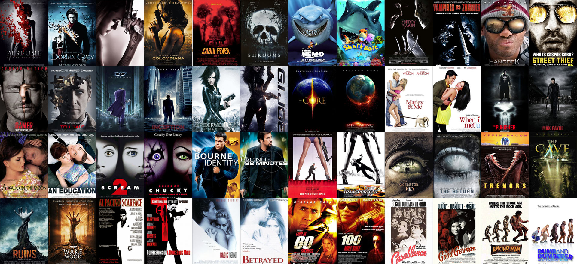
Have you ever wandered through your local video store, searching for that one title until you found it? You pick it from the shelve only to realize that it’s a totally different film, only the cover looks exactly the same as the cover of the movie you came for. It happens more than you think because it’s one of those marketing-tricks. Whenever a movie comes out which is a remake, they rerelease the original with a new coverdesign that is based upon the artwork of the remake. If a movie is popular, there will be without a doubt a low budget clone with a similar cover in a couple of months. A production company like Asylum lives off this strategy with titles like Transmorphers, 100 Million BC, Allan Quatermain and the Temple of Skulls and Snakes on a Train. For a complete list and a guaranteed chuckle look here. There’s also the category “spoofs”, which I won’t handle here as their posters are meant to be mockingly similar towards other film posters.
And you have the fourth version; pure laziness. Why go to all the trouble of trying to reinvent the wheel as decades of movie poster making have given us practically instant templates for us to use? And because of that laziness the shamelessly ripping off isn’t only done by small companies on low budget B-movies, it’s sometimes done on movies that have multimillion dollar marketing machines behind them. Let’s take a look at some really, really lazy work by poster designers:
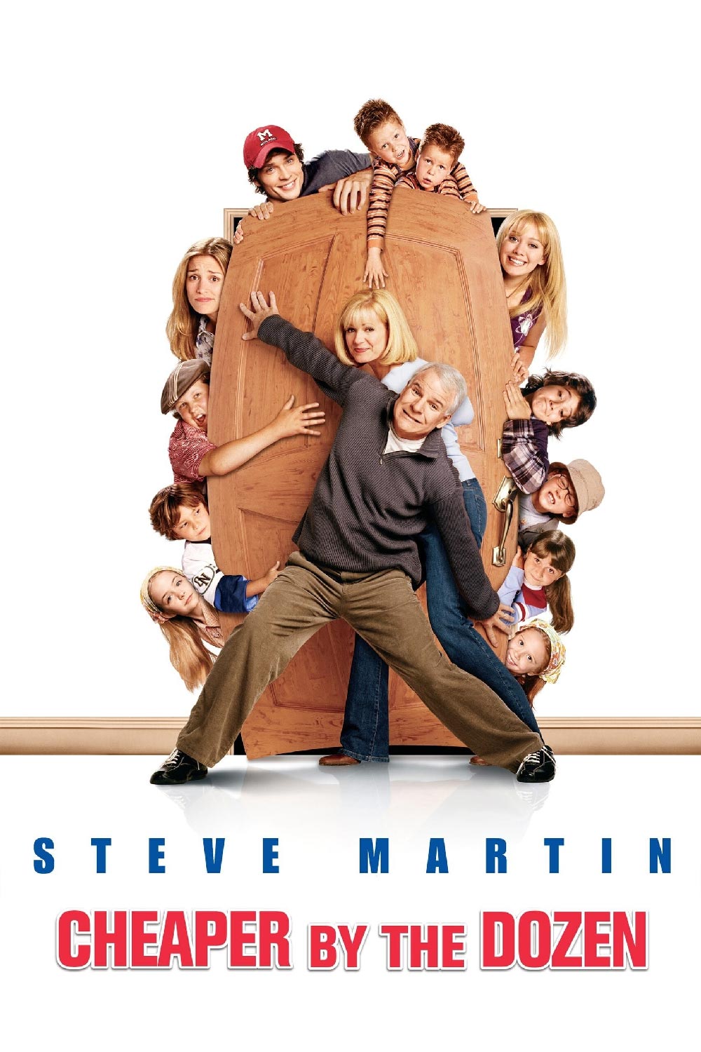
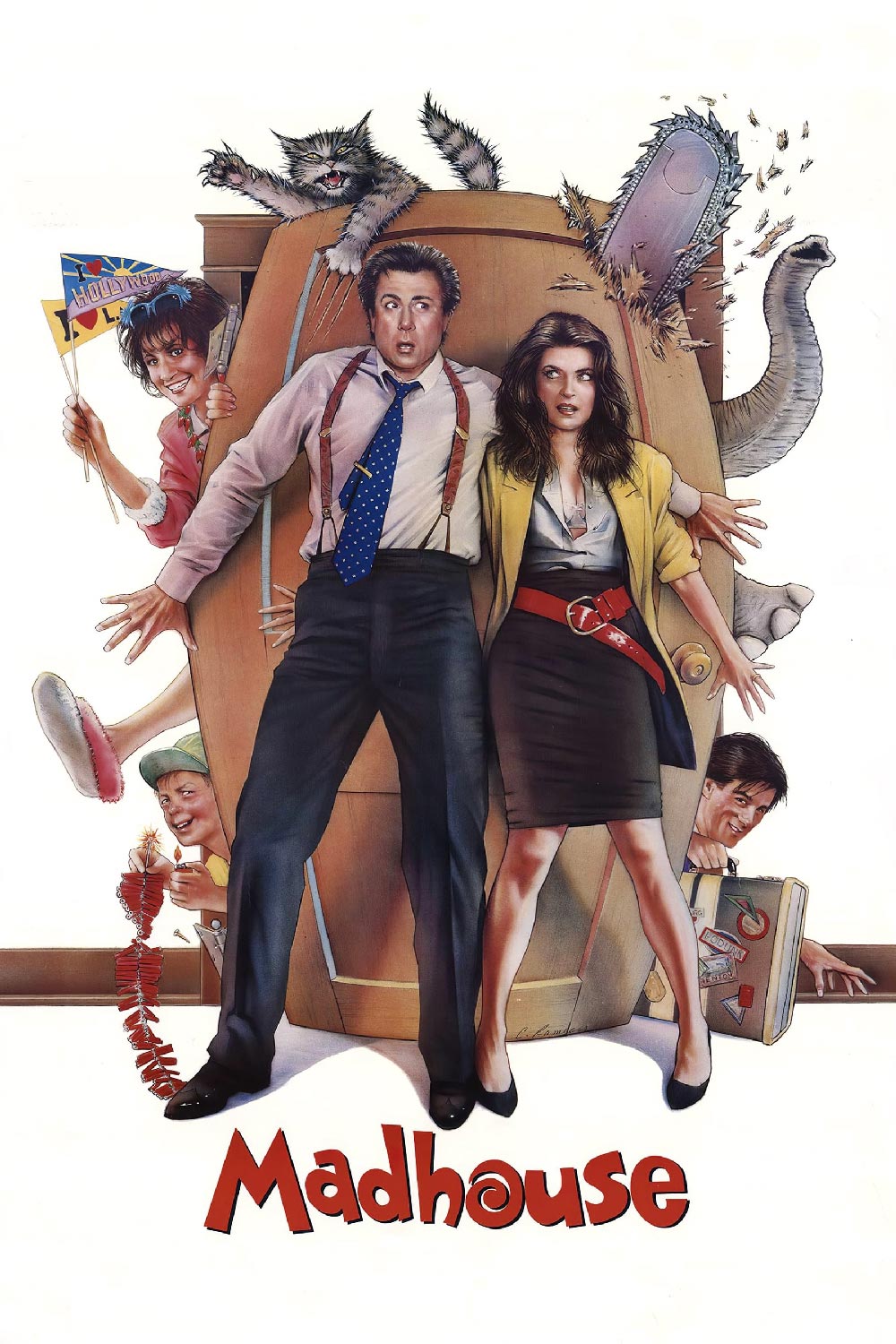
Cheaper by the dozen (2003) – Madhouse (1990)
In 1990 they used a drawing, in 2003 they used photoshop to recreate the entire drawing with actual photo’s. Compared to the original it is actually pretty boring; no elephant, no chainsaw, no cat…
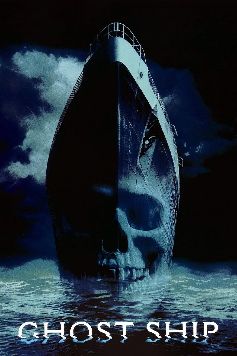
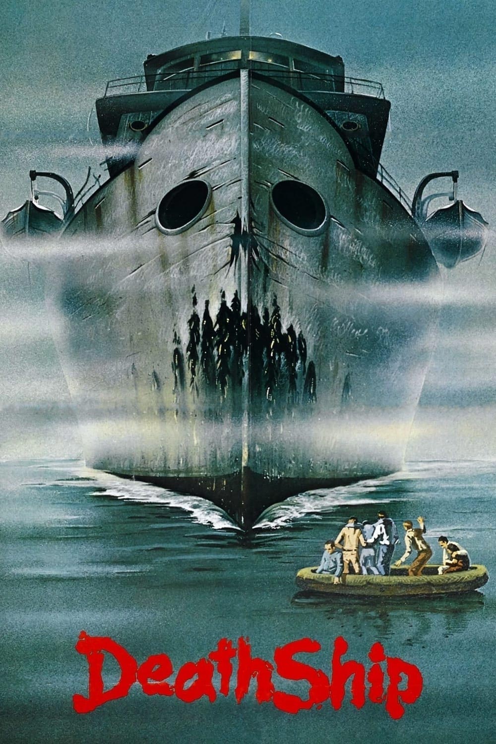
Ghost Ship (2002) – Death Ship (1980)
Although the movie wasn’t all that good I really liked the marketing around Ghost Ship. The poster with “Sea evil” and that cool effect some posters and DVDs had where the skull (dis)appeared based of your point of view from the poster. Now ghost ship movies aren’t the most original movies out there, but when looking at the cover of Death Ship I would say they could’ve been a little more creative. On the other hand, Death Ship is an obscure movie which not many people have seen let alone that they are familiar with the artwork.

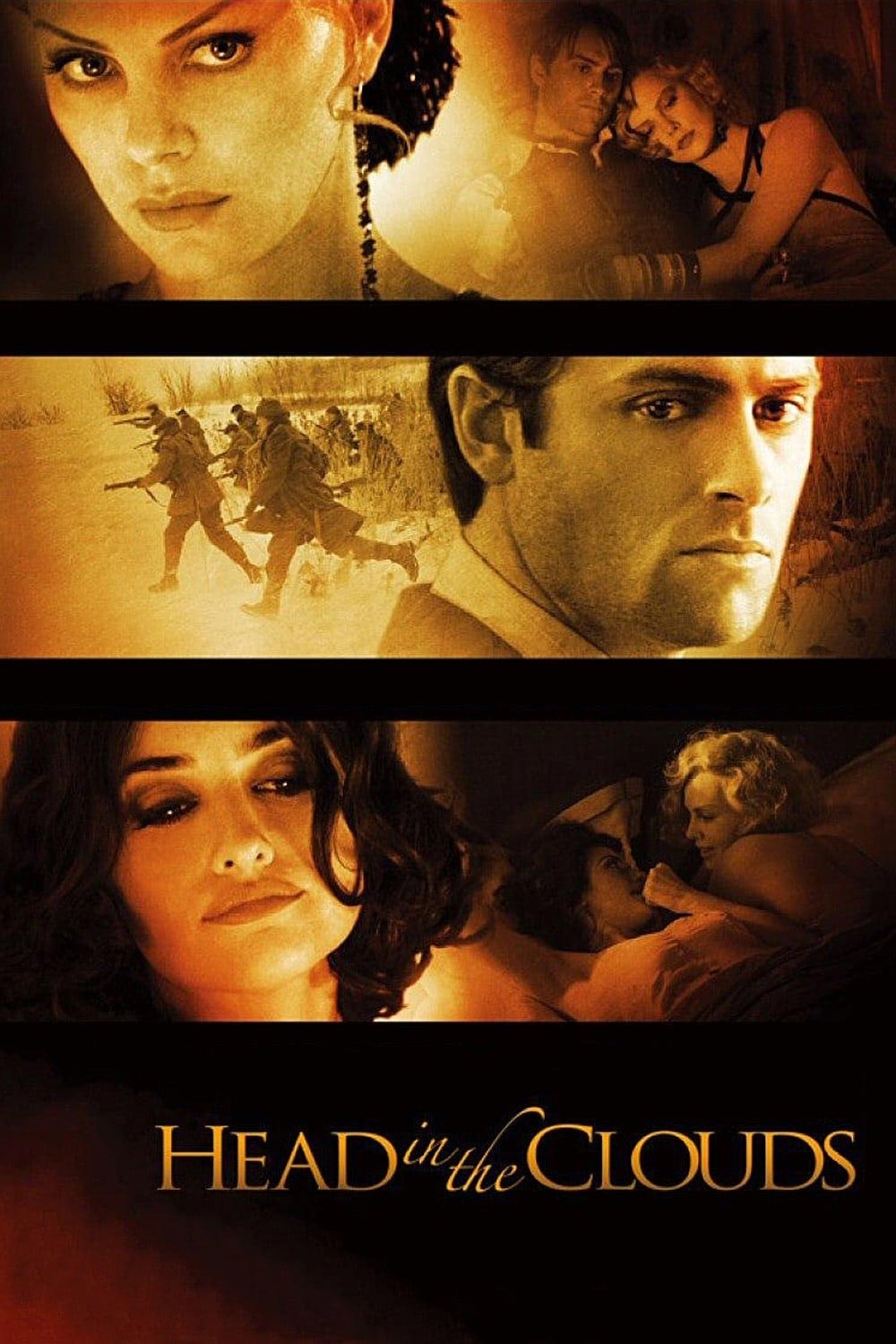
Head in the clouds (2004) – The Four Feathers (2002)
Two movies with no direct relation what-so-ever and both with big name casts. They didn’t just use the template, they also used similar photo’s. The most exciting touch on the poster for Head in the clouds is the dash of red in de bottom left corner. Wow…
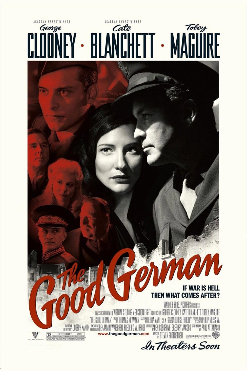
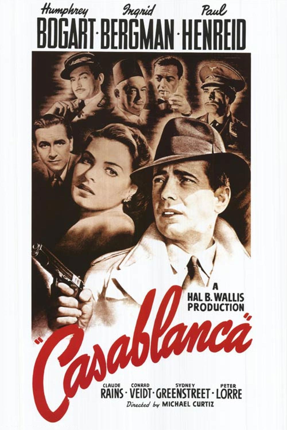
The Good German (2004) – Casablanca (1942)
This is where things start getting tricky, because basically this one is a homage. It was deliberately done, but then again, ripoffs are also deliberately done, it’s just done in more in obscurity.
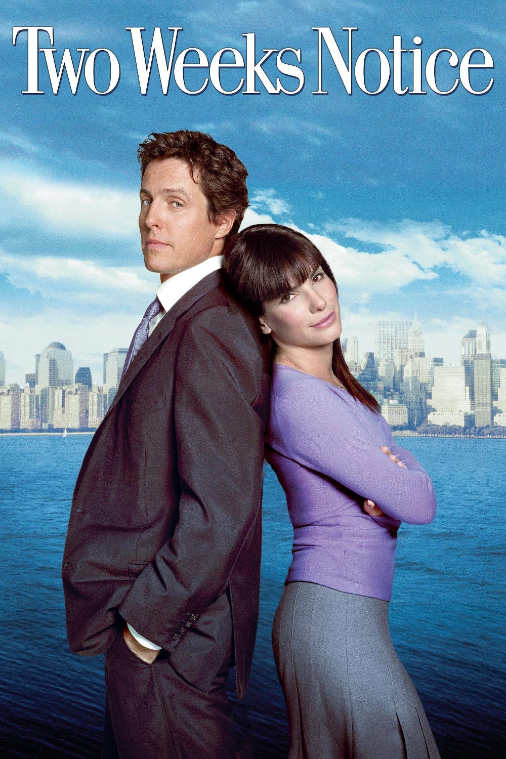

How to lose a guy in 10 days (2003) – Two Weeks Notice (2002)
Ah the romantic comedy, how do I loath thee, let me count the ways… It seems to be the easiest way out to communicate to the audience that our screen couple gets together after being rivals by putting them back-to-back on the poster and looking everything but in love to the viewer or eachother. Unfortunately for “How to lose a guy in 10 days” the poster wasn’t the only thing that was copied from something else…


I LIKE THIS MOVIE RIP-OFFS DO MORE OF THIS